Data Sources and Processing
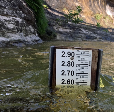
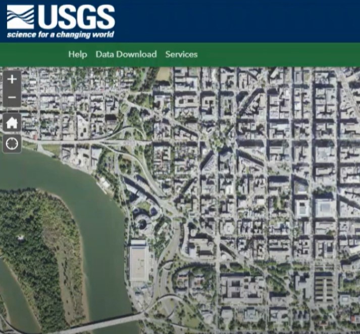
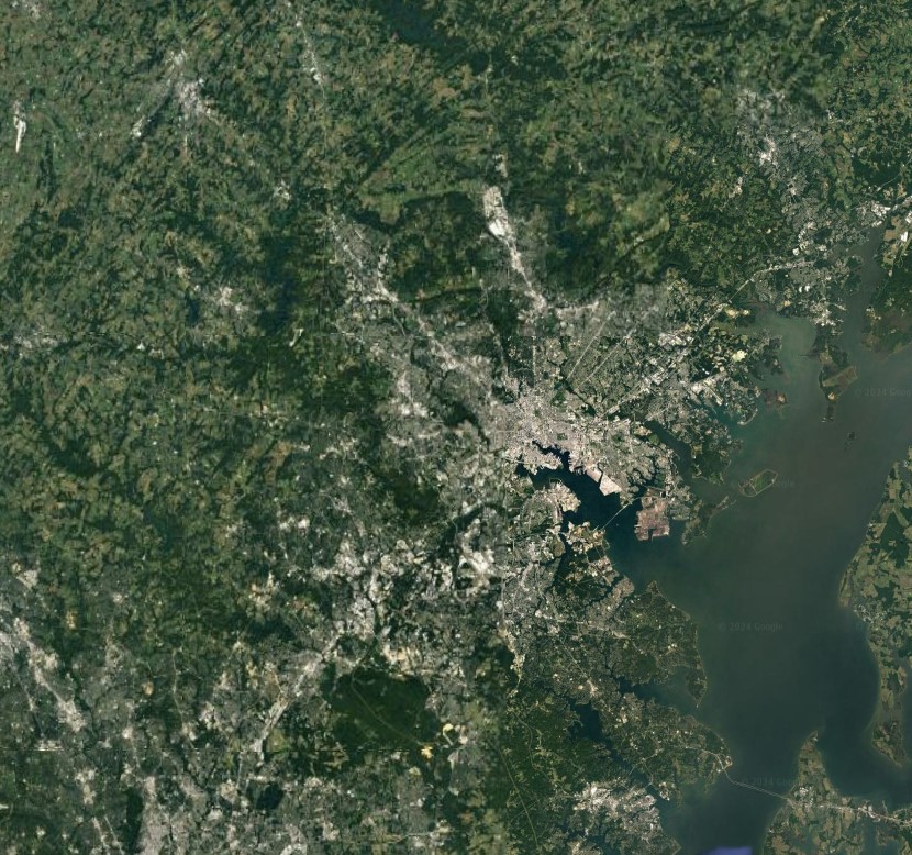
The Streams of Data lessons use numerical data for stream flow and precipitation. They also utilize sattelite imagery for visualizing flood-prone areas, espcially the percentage of impervious surfaces within the area.
Table of Contents
Data Sources
Data Processing: Estimating Impervious Surfaces
Data Processing: Making a Hydrograph
-
Open USGS Water Data for the Nation.
-
Find a monitoring station where data of interest is located.
a. Click on ‘Map of all sites with links to all available water data for individual sites’.
b. Zoom in to the desired location or enter information in the search bar on the left side of the window.
c. Click on the pins to read site information.
d. Click on ‘Access Data’ to see data about that site. This will open a new webpage. -
Examine historical data.
a. For each monitoring site, there is a list of available data.
b. To examine data related to a hydrograph, click on ‘Current/Historical Observations’.
c. Depending on the monitoring site, there will be various available data such as discharge and gage height.
d. Play around with the date ranges to narrow in on the data to be represented in the hydrograph. -
Choose to either acquire a web-created graph (option 1) or acquire the data and make your own hydrograph (option 2).
Option 1: Acquire a web-created graph.
- Select the parameters desired. To create a hydrograph, select ‘Gage Height’.
- For a pre-made USGS graph (which will not be editable), select ‘Graph’ in the output format.
- Select the desired date range.
- Click ‘Go’.
- Underneath the graph, select either ‘Presentation-Quality’ or ‘Stand-Alone’. Right click on the graph and save the graph.
Option 2: Acquire the data to make and manipulate a graph. Some prior knowledge of Excel will be helpful.- Select the desired parameters. To create a hydrograph, select ‘Gage Height’.
- To download the data to manipulate in Excel, select ‘Tab-separated’ in the output format.
- Select the desired date range.
- Click ‘Go’.
- Click Ctrl+A to highlight all the data, and then Ctrl+C to copy the data.
- Paste the data in cell A1 in a blank Excel workbook.
- Replace the sheet name with the number of the USGS gage number to retain that information.
- Delete the first 30 or so rows that start with #, and two more rows so only the data columns with USGS in column A remain. Currently all the text for each line of data is embedded in column A. The next steps will separate the data into their own columns.
- Highlight column A.
- Under the ‘Data’ tab, click ‘Text to Columns’.
- Select ‘Fixed Width’. Click ‘Next’.
- Click ‘Next’. And Click ‘Finish’.
- The data should now all be in their own columns instead of as text all in column A. Insert a row above the data and add appropriate headings for the columns.
- Insert a column to the right of the time column. Label this column Date+Time. In row 2 in this new column, enter a formula to add the date and the time together so they appear in the same cell. For example, if the date displays in column C and the time displays in column D, the formula in the new Date+Time column would read “=C2+D2”. Apply this formula to the entire column.
- To create a hydrograph, highlight the Date+Time column and the gage height column.
- On the ‘Insert’ tab, select a scatter plot and the graph should appear.
- Adjust axes, labels, colors, etc. within Excel.
Project Funding
This material is based on work supported by the National Science Foundation under Grant Nos. 1906264 and 1906286; Collaborative Research: Streams of Data: Nurturing Data Literacy in Young Science Learners. Any opinions, findings, and conclusions or recommendations expressed in this material are those of the authors and do not necessarily reflect the views of the National Science Foundation.


